PREFERRED HOTEL GROUP
OVERVIEW
Web Design
Hospitality
E-Commerce
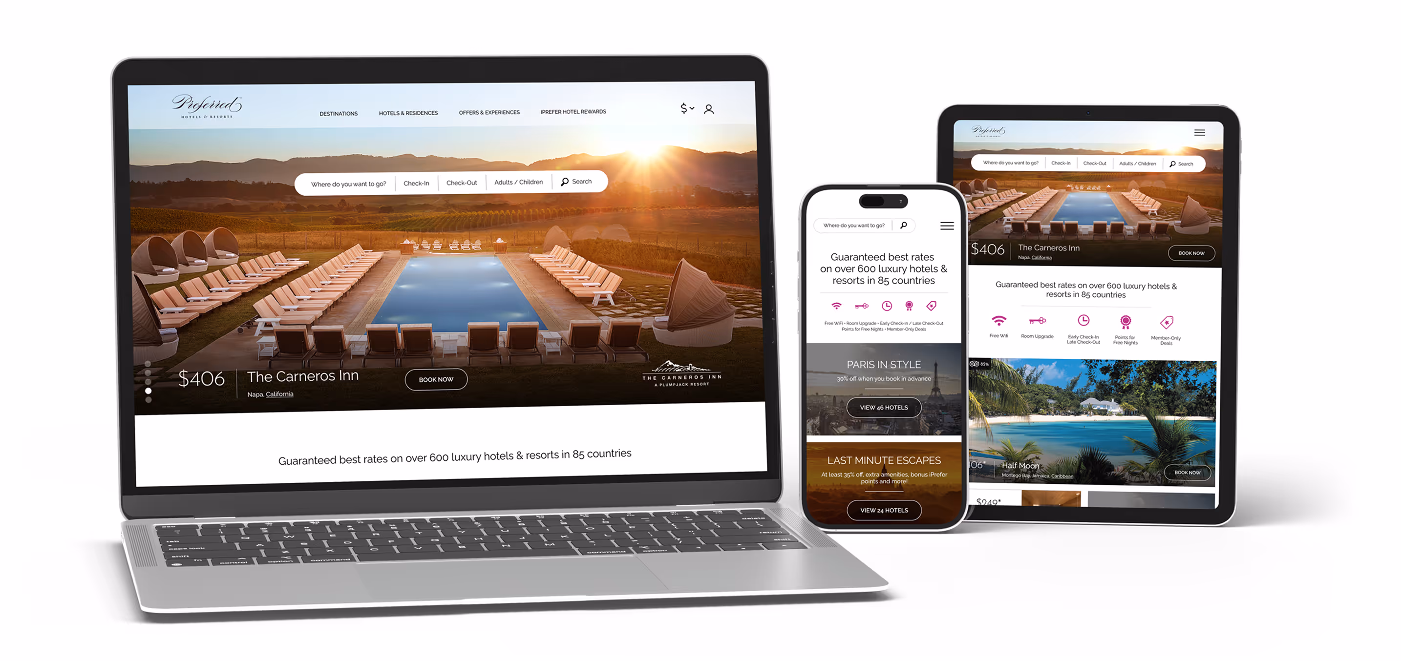
Preferred Hotels & Resorts had noticed a lag in conversion and felt their engagement could be better but didn't know how to go about capturing users and converting them.They needed a complete website redesign including a total reworking of their checkout process.
A lot of thought went into tactics that dovetail into the emotional needs of the consumer at various points within their journey. Most luxury travel is still booked on desktop computers rather than mobile devices. Mobile is where browsing takes place. So the strategy was to give them what they want, when and where they want it.
A lot of thought went into tactics that dovetail into the emotional needs of the consumer at various points within their journey. Most luxury travel is still booked on desktop computers rather than mobile devices. Mobile is where browsing takes place. So the strategy was to give them what they want, when and where they want it.
CHALLENGES
The lifecycle of a luxury travel shopper is a complex and lengthy process. The challenge was to speak to them in their language at various points throughout the process while still remaining a cohesive experience.
THE LIFECYCLE OF THE LUXURY TRAVEL SHOPPER
DREAM
LEARN
FIND
CONVERT
Facilitate inspiration
Inspire with imagery
Promote discovery
Allow people to find experiences and be inspired by the act of browsing and dreaming. People might not know what they want yet.
Facilitate investigation
Inspire with scenarios
Promote sharing
Allow people to turn dreams into possibilities through stories. Allow them to get others excited as well. Give them high-level information.
Facilitate a deep dive
Inspire with details
Promote planning
Allow people to give structure to their ideas. Turn dreams into plans through detailed information. Here is where price is most important.
Facilitate booking
Soothe with simplicity
Promote confidence
Towards the end of the life cycle, shoppers move to desktop for larger imagery, more details about the location and to make a purchase. Remove any friction or fear.
PROTOTYPING
Luxury shoppers are highly engaged with pages that feature micro-interactions and engaging visuals so prototyping heavily featured animation and visual delight. . Not all of it got implemented but it was worth exploring.
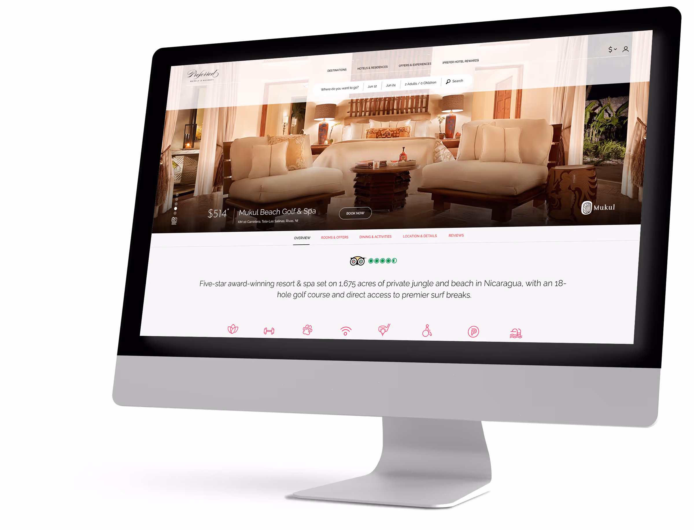
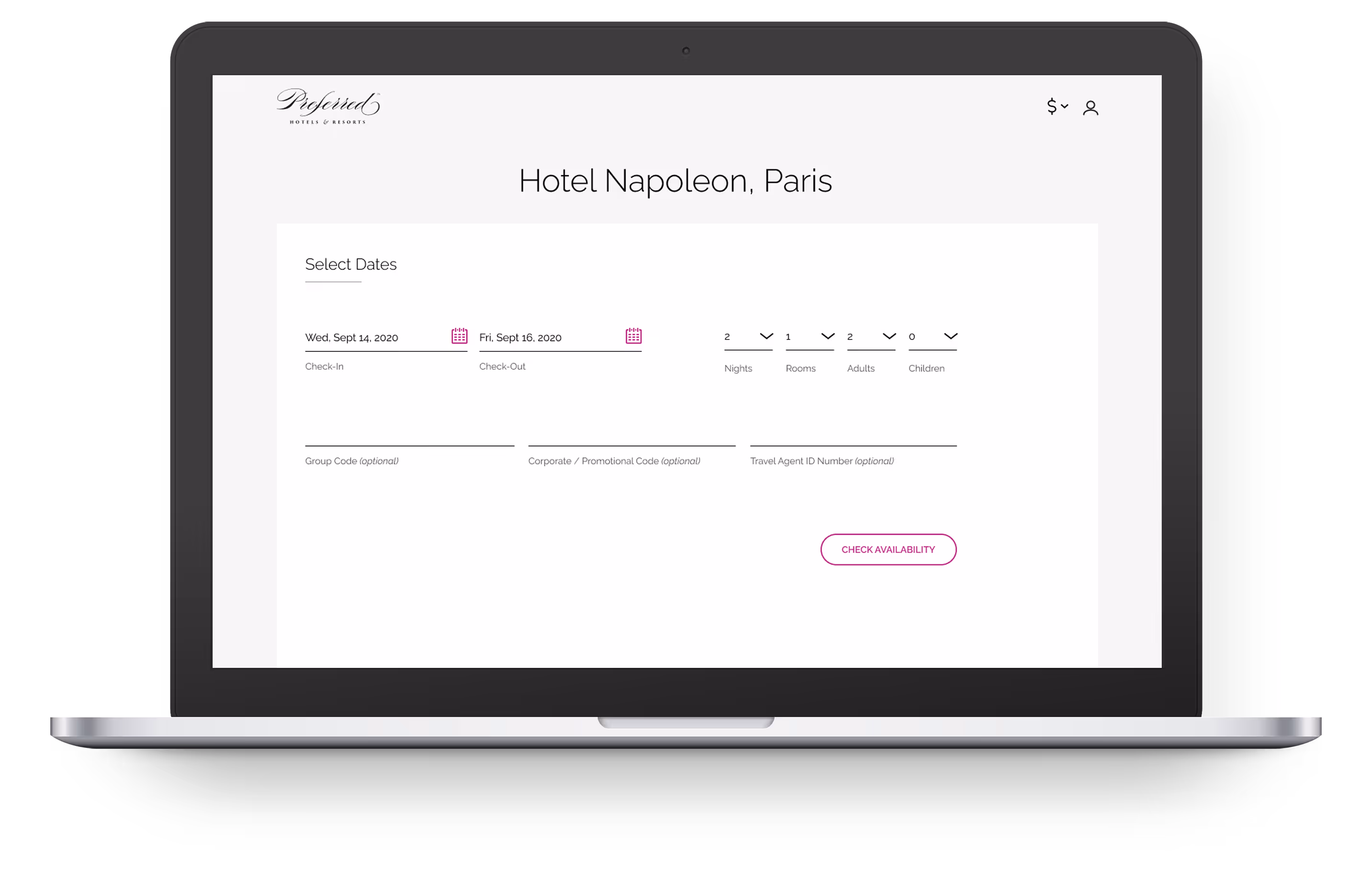
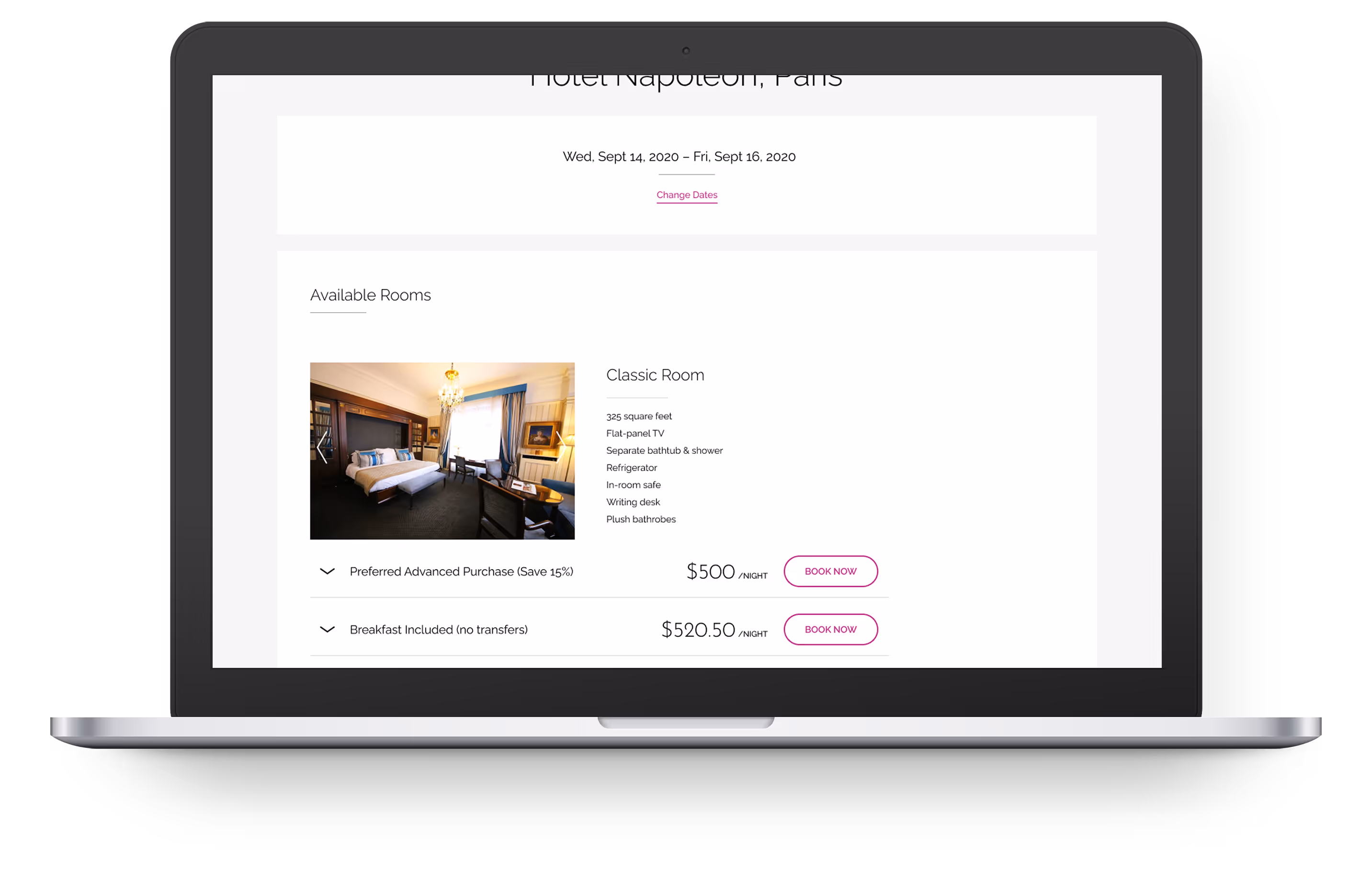
PROPERTY PAGE
The Property Details page was the most frequently entered page (via SEO). Originally, there was little engagement as the copy was lengthy and difficult to read, and the various sections were split up into 5 different URLs per page. For the redesign, the copy was completely rewritten for clarity & scalability, and the page was consolidated into one URL split with jump links that mimicked the structure of the 301 redirects.
Great pains were taken to bring forward room data and imagery outside of the Global Distribution System (GDS) which managed room availabiltiy.
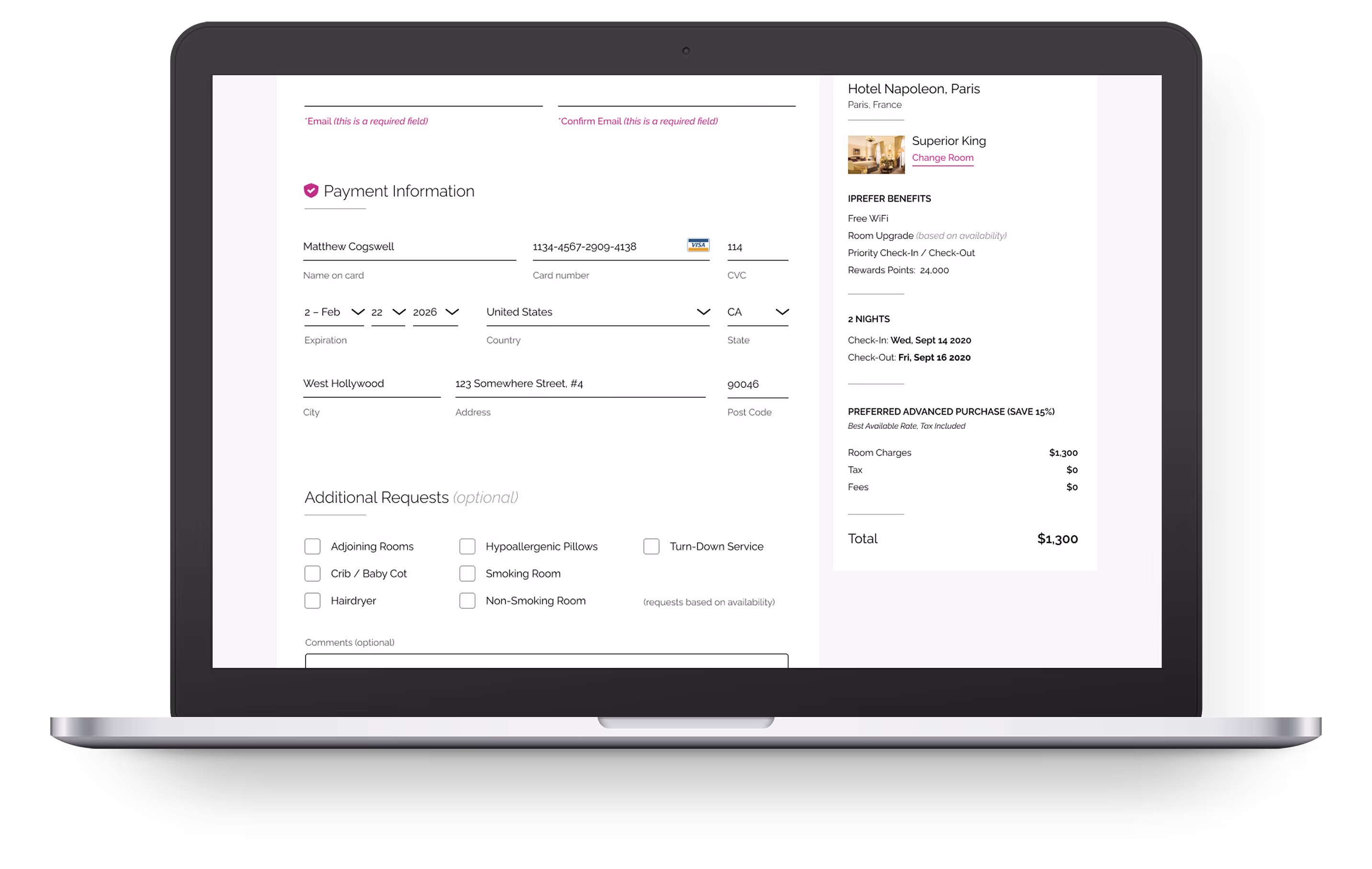
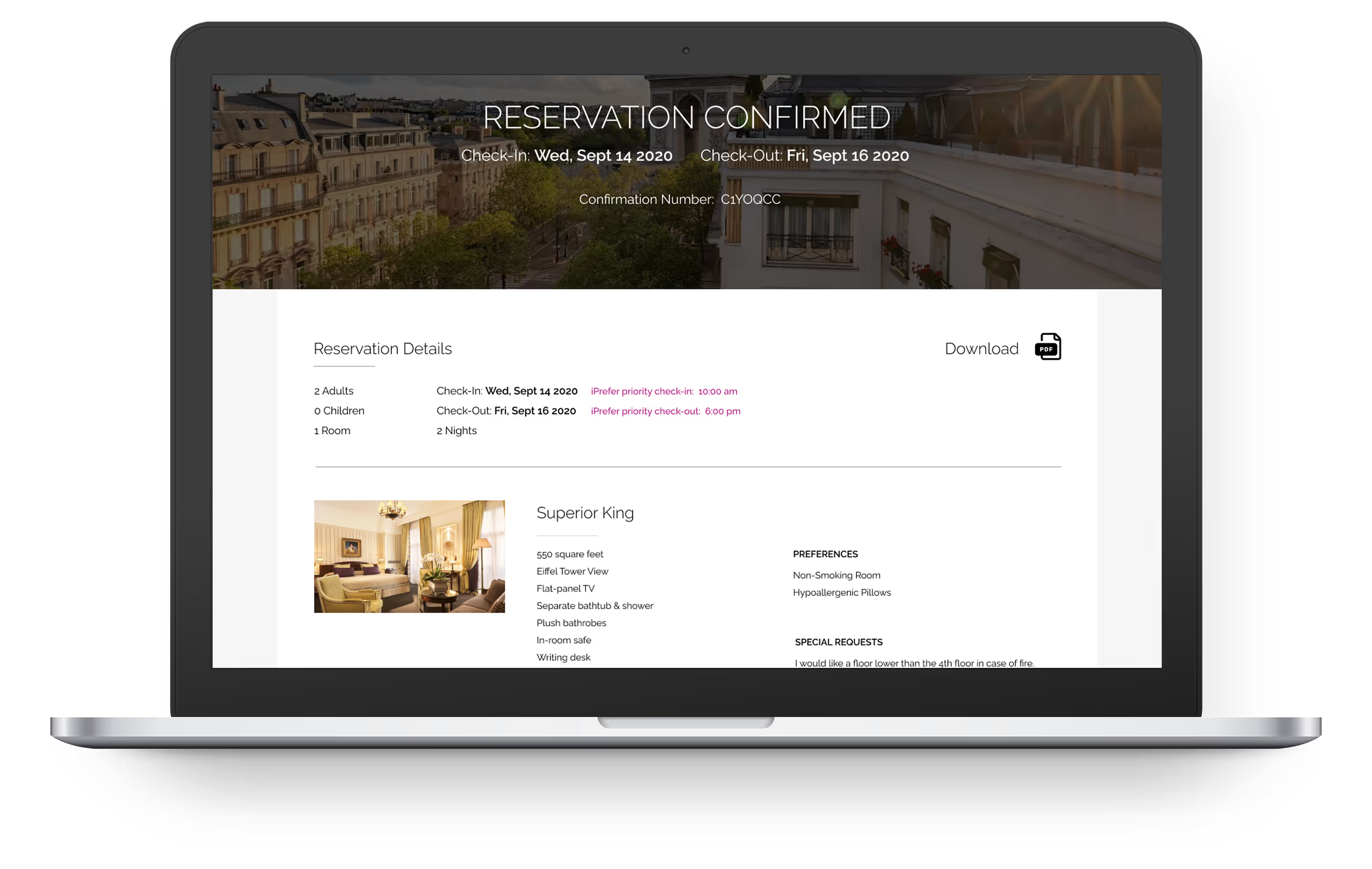
CHECKOUT
The checkout process needed to be completely redesigned. It was simplified to four steps. There were many restrictions as to what could and could not be done, as the system is powered by SABRE (the Global Distribution System) and SynXis (the Global Reservation System) and is neither hosted nor controlled by Preferred Hotels & Resorts so a strong collaboration was needed to maintain a consistent look and feel to reduce confusion.
Research showed that once in the checkout flow, removing the main nav items reduced “ADHD Bounce” and increased conversions by keeping consumers in the flow. The redesign was made to be clear, easy to use, and inspire trust.
Research showed that once in the checkout flow, removing the main nav items reduced “ADHD Bounce” and increased conversions by keeping consumers in the flow. The redesign was made to be clear, easy to use, and inspire trust.
OUTCOME
By strategically implementing UX targeting, we were able to increase mobile engagement by 83% reducing page bounce and leading to higher conversions. The cart checkout redesign reduced abandonment by 25% demonstrating how attentive UX and UI design can strengthen business goals.
ACHIEVEMENTS
Average Order Value Up:
10%
Mobile Engagement Up:
83%
Traffic Up:
33%
Cart Abandonment Down:
25%